Boosting conversions with a merchant page redesign
Details
2024 – 3 months
Lead designer
Research, IA, Wireframing, Visual design, Data analysis
Overview
As the lead product designer for this project, I redesigned the Cashrewards Merchant page to make offers instantly clear, key conditions impossible to miss and actions effortless while introducing one-tap sharing to drive referrals and boost cashback conversions.
DISCOVERY
The problem
The previous merchant page lacked clear visual hierarchy. Members found it difficult to scan, locate and understand the most relevant cashback details. Missing or overlooked terms and conditions often caused confusion or disputes, impacting trust.
As the lead UX designer, I reframed this challenge into a problem of information architecture and trust-building.
I identified that poor hierarchy and inconsistent grouping were driving user frustration, and worked with stakeholders across Product, Legal and CX to:
-
Redefine the content hierarchy and highlight critical details above the fold.
-
Introduce progressive disclosure to reduce information overload.
-
Systemise design components for consistency and scalability.
-
Ensure legal accuracy while improving accessibility of T&Cs.

DISCOVERY
Research and insights
6 user interviews with frequent Cashrewards members of the merchant page and member insights from the customer experience team, revealed:
Hard to scan & digest
Users described the page as “overwhelming” and “wordy”; observed back-and-forth scrolling during interviews
Long & inconsistent sections
Web-based structure didn’t adapt well to mobile, causing excessive scrolling
Terms & conditions missed
4/6 users didn’t notice them until prompted. Member Services flagged this as a common complaint driver
Cashback info scattered
Offers, rates, and restrictions appeared in different places - increasing mental load
No easy sharing
Users had been asking for it — an easy way to share cashback offers and refer friends to Cashrewards.
I analysed this research and concluded that the solution cannot just be a visual refresh, but a strategic solution to improve comprehension, reduce disputes and build member confidence to shop on app.

I discovered we could use a single topic template adaptable across merchant, promotions, and campaign pages.
DISCOVERY
Iterative exploration and design goals
I drove the strategic direction of the redesign by leading a cross-functional workshop with the squad, presenting customer insights and a competitor analysis to align everyone on the problem space. Through an ideation session, I facilitated brainstorming and rapid sketching to generate potential solutions. I then synthesised the strongest ideas, prioritising them against business goals, user needs, and technical constraints and translated them into actionable designs.
Design exploration focused on maximising header space for merchant branding, grouping related content, and refining special terms display. This raised opportunities to systemise components, use progressive disclosure for dense text, reduce scrolling, and reorder content to support personalisation.

IDEATION
Collaborating with stakeholders to restructure content
The previous web-based design was overly long and inconsistent, making it difficult to track user interactions, and assumed all information had to be displayed upfront.
I identified these usability and tracking issues, then led stakeholder alignment sessions to prioritise content hierarchy and readability. I facilitated discussions with Legal to streamline cashback details, restructured T&Cs for clarity and worked with the squad to group critical information so it was easier to find and act on.

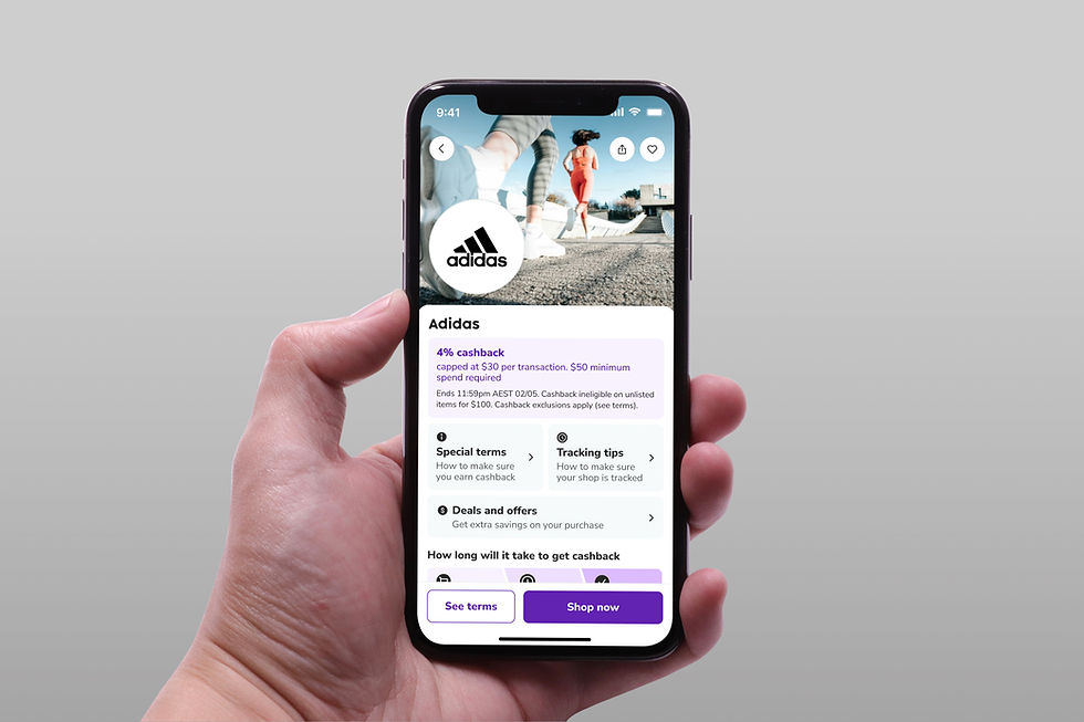
FINAL SOLUTION
A flexible, modular merchant page design
The final design introduced a modular system that allows flexible customisation of merchant pages based on content needs and user journeys, while prioritising critical information. Visually consistent content grouping improves scannability, with the most important details placed above the fold.
App transitions and native mobile gestures enhance navigation and usability, while minimising shared components across variants speeds up development. The redesign also enables detailed interaction tracking on different sections through Amplitude event tracking, providing richer insights for ongoing optimisation.

METRICS / RESULTS
Increased Shop clicks
Launched the final solution as an A/B test with the old merchant page.
From analysing behavioural data on Amplitude, I discovered the following impressive results:
-
20% increase in 'Shop now' button conversion, boosting primary CTA engagement.
-
16% increase in transactions on the new design, showing the redesign translated into tangible business impact.
-
14% reduction in merchant-page related support tickets, particularly around T&Cs
-
59% increase in time to convert – dropped from 44s → 24s, showing users act faster on critical info.
-
12% increase in Special Terms clicks, thanks to two clearly visible access points.
-
45% increase in time to first action, indicating quicker discovery of essential details.
✅ System Usability Score (SUS)
-
Before the redesign, the merchant page scored 68 (marginal usability).
-
After the redesign, the score increased to 82 (excellent usability) based on post-test surveys with participants.
-
This reflects that members found the new page easier to navigate, faster to use and more trustworthy.
Before

After